
Overcoming Cultural Barriers & Stigma
PEER MINDS
How might we frame mental health support so it feels safe, relatable, and culturally grounded for MENASA youth—effectively lowering the barrier to services.
-
Brand Strategist & Presentation Designer
-
8 Weeks
-
Value Prop & Narrative Architecture, Message Maps, Presentation Dsiger
THE ORIGIN
Peer Minds wasn’t built out of an academic textbook or a clinical setting—it was born from lived experience and the painful gaps witnessed in our own families and communities.
THE CHALLENGE
Breaking the Silence
Peer Minds is an innovative organization dedicated to helping Middle Eastern, North African, and South Asian (MENASA) youth and adults access culturally grounded mental health support.
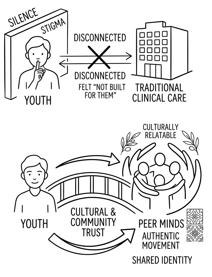
While the demand for mental health services has skyrocketed post-COVID, the existing healthcare infrastructure fails this community. It treats mental health as purely clinical and culture-neutral.
In the MENASA community, this creates a dangerous clinical-cultural gap. Mental health is often dismissed as a private family matter or shrouded in deep cultural stigma and shame tied to identity and reputation.
Peer Minds came to me with a challenge: articulate what made their organization unique and turn it into a compelling story. Together, we identified their core differentiators and translated them into messaging and a presentation that could attract new members and funders.
Compelling Narrative: Peer Minds story is worth telling but it was getting lost in the various programs and services. They needed a single-minded value prop that made it clear what they are fighting for.
Plain Language Storytelling: Founder was clear from the start that he didn’t want the copy to sound like marketing. Instead we let the story do the work for us.
Strong Visual Design System: Peer Minds had some brand elements like colors and fonts but lacked a strong visual brand that told their story; using photography as both aesthetic and a powerful symbol.
RESEARCH
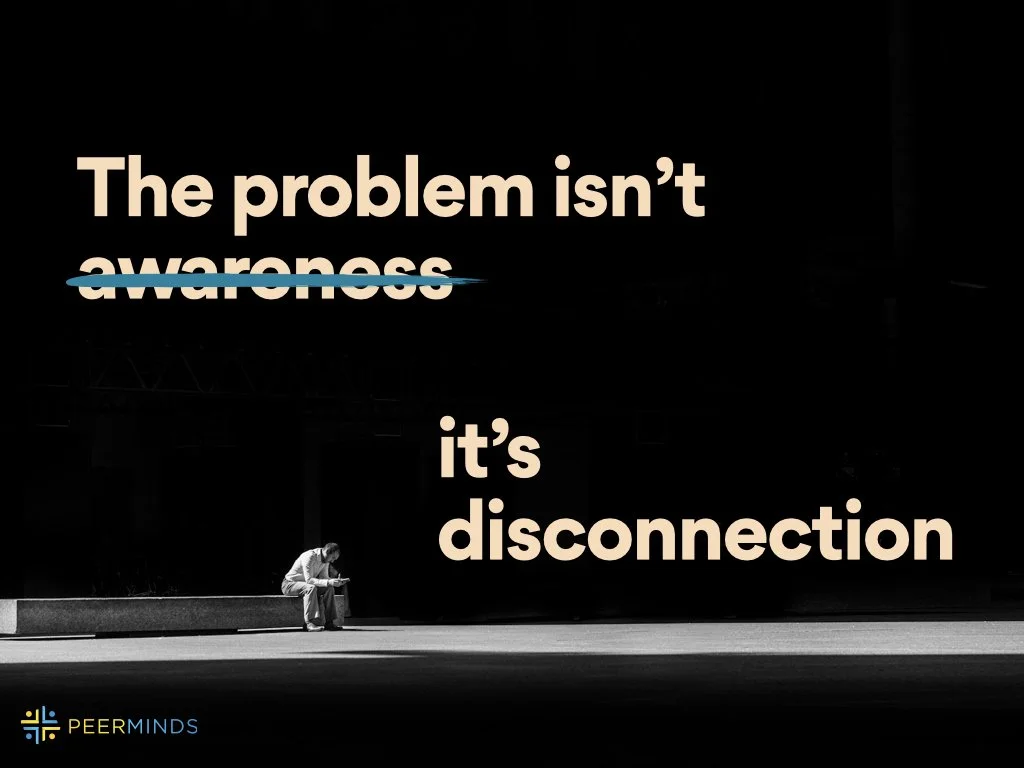
The Problem Isn't Awareness. It's Disconnection
To build a message that resonated, we first needed to understand what the audience was up against and why existing solutions weren’t connecting.
Instead of leading with abstract features or clinical jargon, we used the "Name the Enemy" framework. By explicitly defining the cultural barriers and systemic gaps—the shared frustrations the youth face daily—we shifted the narrative from a dry pitch to an urgent, problem-solution story; letting the raw truth do the heavy lifting.
-
The Silence Struggle
Traditional mental health systems are failing MENASA youth because they ignore the lens of identity.
This shows up as:
Silence in families
Shamed tied to identify and reputation
One-size-fits-all care that doesn’t reflect lived experience
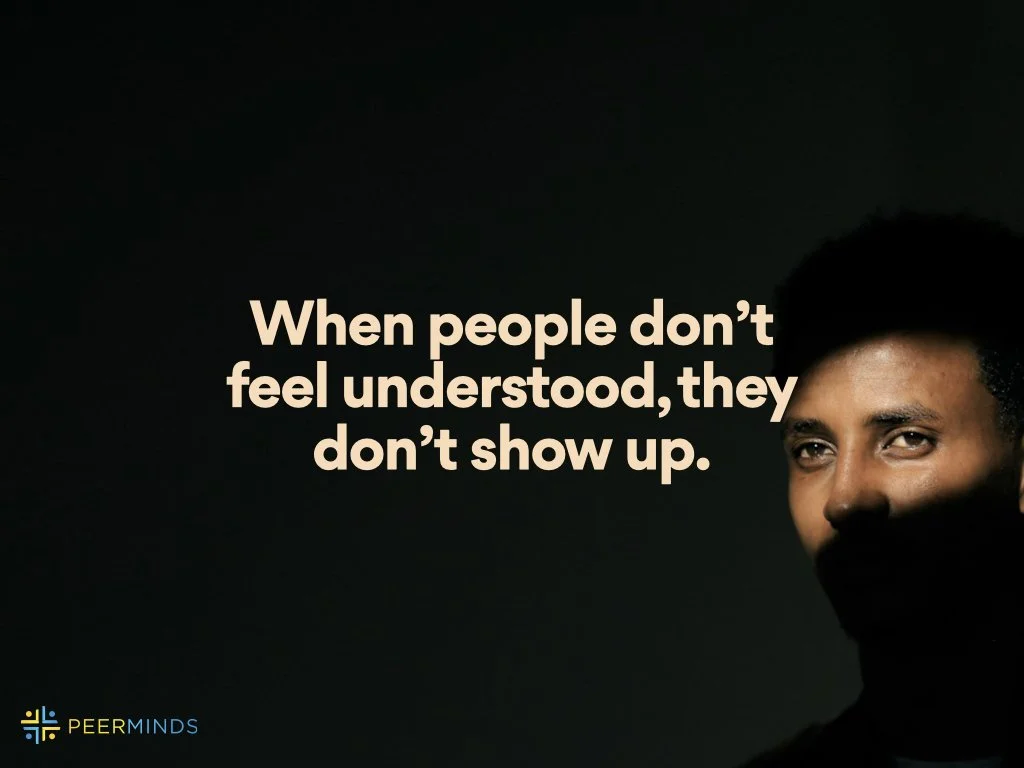
People struggling alone because they don’t feel understood
-
People don’t avoid help because they don’t neet it–they avoid it because it doesn’t feel like it’s for them.
If this continues
Youth and young adults isolated
Mental health struggles escalated
Communities continue to lose people to silence, stigma, and lack of access
Those who want help never take the first step
-
Healing doesn’t happen in isolation; it happens
In spaces where people feel seen
In conversations that reflect lived experience
Through others who understand the experience you’re facing
-
Peer Minds exists to fight cultural disconnection by building- community-centered mental health support.
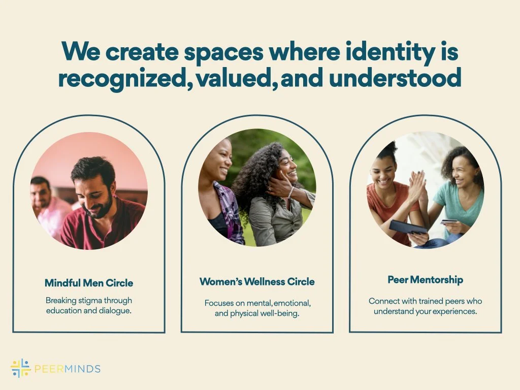
Culturally grounded spaces where identify is understood
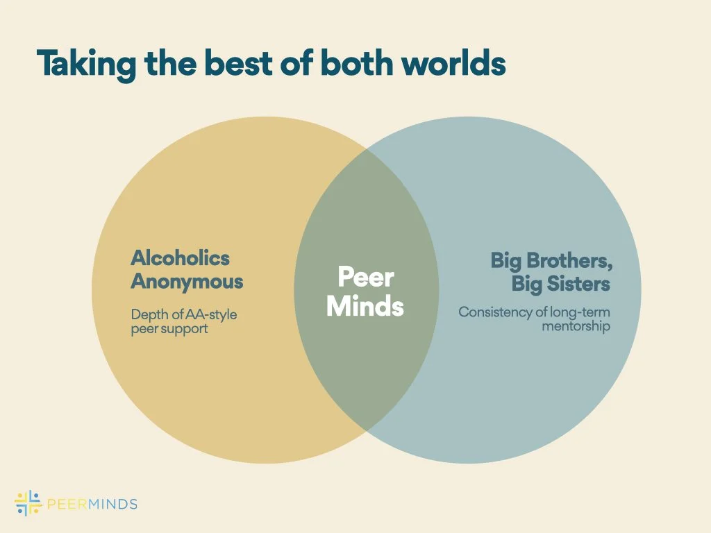
Peer-driven support system rooted in shared experience
Structured pathways from participant to mentor to community leader
-
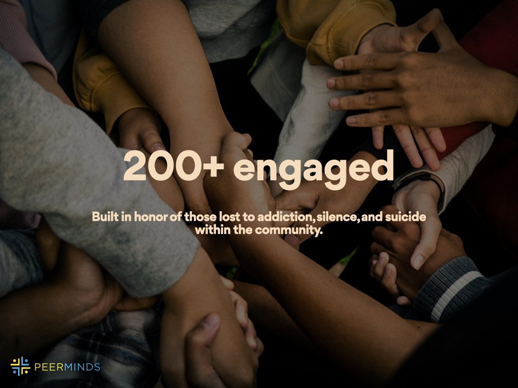
Founded from lived experience rather than theory or clinical practice, Peer Minds engaged nearly 200 participants and achieved strong retention through meaningful, repeat attendance.
Visual System & Presentation Design
DESIGN
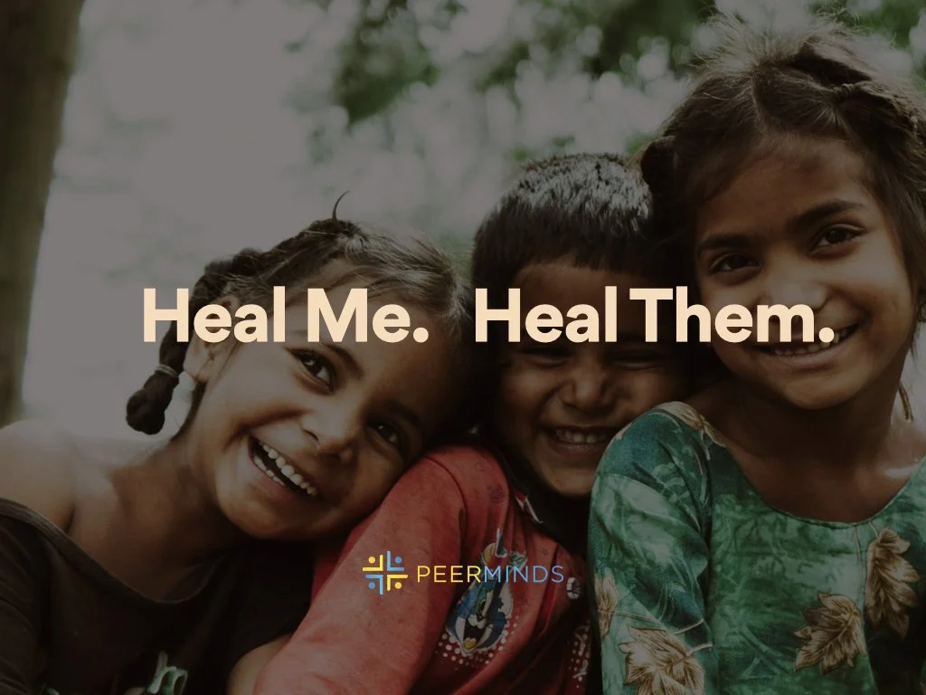
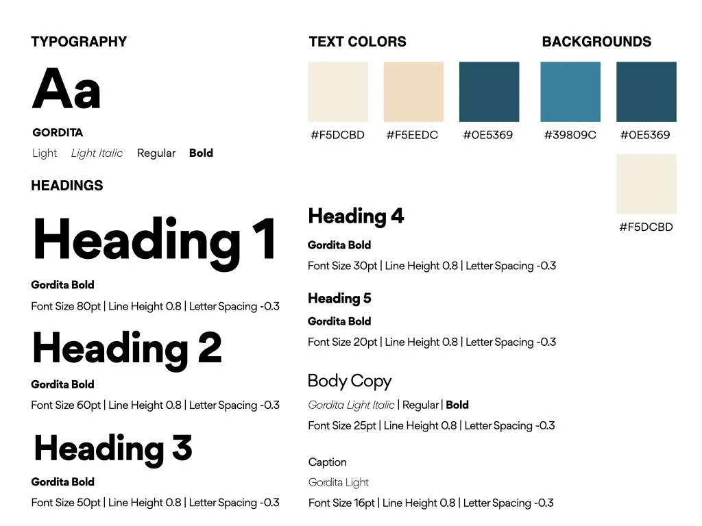
Peer Minds required an aesthetic that felt authentic, grounded, safe, and entirely non-corporate. I developed a visual system utilizing warm, welcoming tones and human-centric photography.
-
We use Gordita for its modern, clean, and geometric properties.
Headings: Gordita Bold with tight line height of 0.8 and aggressive -0.3 letter spacing for a punchy, editorial feel.
Body & Captions: Gordita Regular, Light, and Light Italic to maintain high legibility while separating narrative quotes from data points.
-
The color was designed to feel organic, safe, and calm:
Primary Backgrounds: Deep Teal and Soft Slate Blue
Accents & Text: Warm Cream and Soft Sand